All-Caps, Underlining, Hyphenation, Italicizing, Bolding, Ornate Typefaces, and Their Effect on Readability
Appearances Do Matter

Before the 1960s, linguistics primarily dealt with orality as opposed to literacy. Since then, they have been considered intimately entwined. And readability to writing is as diction is to the spoken word.
I suppose that the general intent of a writer is to influence the reader. And influence can have many meanings. A writer might wish to inform you, to warn you, to impress you with his knowledge and creative perspective, to entertain you in various ways, to urge you to act or to curb your activity, to change your opinion, etc.
The first objective of a writer is to get the reader’s attention. The second objective is to state a message in a way that is clearly expressed with supporting premise and logic. And the third objective is to place the message in a layout designed to encourage the reader’s eye rather than to put up visual roadblocks.
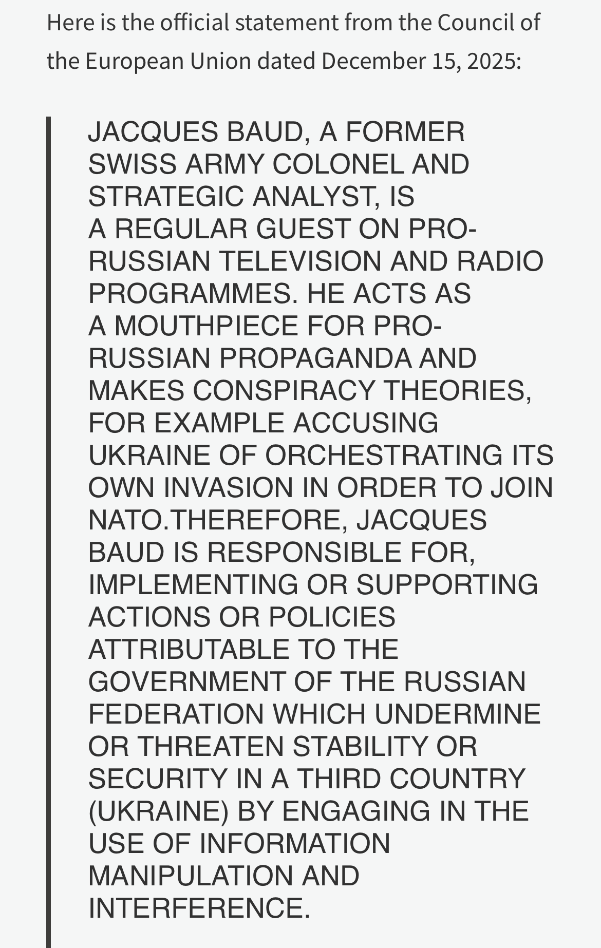
Less than a month ago, in "My Editor" , I mentioned the importance of appearance in the quest to convey a written message. Four days ago, I received a notice from my landlord which contained the following excerpt:

I’m not a highly skilled typographer, but I know enough about typography to recognize a neophyte in the subject. And whoever crafted this disaster undoubtedly did it because they believed that it needed to be emphasized as if it was being yelled loudly by a town crier in a community before the advent of general literacy.
Granted, increasing the line spacing in the above example would ameliorate the poor readability, but the all-caps remains an unnecessary impediment.
No doubt, you have experienced such near-blinding presentations of type. It is common practice among legal professionals and government workers. It is standard fare in statutes and formal resolutions enacted by our elected officials and regulatory agencies.
I often read comment boards wherein a commenter writes in all-caps, apparently because the commenter wants his message to stand out. [I’m wondering if this is a tendency more of men than of women. Also, I’m wondering if it is indicative of a bully personality. Hmm…]
[As I’ve mentioned elsewhere, I once berated a guy for sending me a long email in which he used hyphens between all the words instead of spaces (perhaps more difficult to read than the above in all-caps). He then pleaded for my forgiveness, explaining that his space bar was broken.]
But as you should appreciate, the blocked effect of all-caps accomplishes just the opposite of emphasis.
If I wanted to dissuade my reader from reading my writing, I would write long passages in all-caps.
If I wanted my reader’s eye to inadvertently skip over a large section of my writing, I would put that section in all-caps.
If I wanted to obscure an onerous provision of a contract to deceive a party to the contract, I would cloak that provision in all-caps while using the ploy that I properly apprised the party by expressing it in all-caps.
If I wanted to impede comprehension of a new law so that I could later accuse someone of breaking that law, I would bury the provisions in a forest of all-caps.
If I want to pass a bill that I feared someone in Congress might actually read, I would write it in thousands of pages of all-caps font.
Possibly, all-caps is weaponized type!
In approximately 1980, Arthur Jones was questioned in court regarding his tax returns. I now paraphrase what I believe was the exchange between the attorney for the IRS and Arthur:
Attorney: “Mister Jones, I have here the tax returns you signed for the past several years. Do you testify that these documents represent your company’s performance?”
Arthur: “Yes.”
Attorney: “Mister Jones, do you warrant that this is your signature on each of these documents?”
Arthur: “Yes.”
Attorney: “Mister Jones, did you understand the IRS regulations and the meaning of those regulations when you signed these documents?”
Arthur: “Young lady, I seriously doubt that anyone in this courtroom has ever completely understood anything that they ever read in the IRS regulations.”
The court broke out into applause.
Note that if I write the above passage from my landlord, but leave one word—any one word, located anywhere in the text—in lower case, it will be that word that stands out. The rest remains a dense jungle. It’s as if Mozart wrote a sonata simultaneously sounding all the keys he could press with both forearms on a keyboard. Although one might suppose, “There’s a wonderful sonata amidst that cacophony,” no one would be listening to Mozart.
Just to ensure that you’re sensing my attitude correctly: One of my greatest pet peeves is the abuse of all-caps. Certainly, all-caps has a place. I occasionally use it, but very sparingly. And in so doing, I later often wish that I had not.
Very brief applications—road signs, are best read in all-caps:
STOP
YIELD
SLOW
Note that “CURVE AHEAD” reads better in when the words are stacked.
All-caps is sometimes unavoidable. Many news crawlers and closed-caption options are not enabled to provide other fonts, and if and when they might have these offerings, I doubt if the networks want to further complicate these services. YouTube’s closed captioning uses both upper and lower case and is much easier to read than the all-caps used elsewhere, of course it incorporates little if any punctuation.
Brenda and I often study advertisements painted on vehicles and on billboards. We admit that all-caps is the best solution to many graphics issues in brief promotional statements, however many of them would be vastly more readable if they were merely capitalized (first letter in upper case) instead of written in all-caps.
There are better ways to make the occasional word or phrase stand out from the written text, especially in prose. And often, this is far better effected in writing than in speech. With speech, we commonly see someone use so-called air quotes employing two fingers of each hand to imitate quotation marks that would have been otherwise seen in writing. However, air quotes cannot be used to distinguish between a literal quote and nonquotes that the speaker wants to set off. And in pure audio presentations, like on the radio, the air quotes are useless.
[If I state the title of a book or movie or imply a nonliteral meaning (George crossed the Rubicon when he committed to the contract.) or apply an idiom or metaphor, I place these nonquotes—my word for these applications although I have encountered non-quote in other applications—in italics.]
[There are ways to set off nonquotes (with italics or underline or bolding) with texting on my phone; however, I have not learned to do it. And I never receive texts that use these options. I suppose that this is because others have not learned this option or because they consider it awkward, slow, and annoying. After all, texting is not actually intended for extended prose, but for very brief, simple, and direct statements. It can be employed for expanded application, although clumsily when directly typed into a panel.]
I have a rigid rule. I never—if possible—use quotation marks in my writing unless they are to denote a quote. I want to provide certainty to my reader that quotation marks indicate a quote and nothing else. This is extremely important to ensure accuracy. I cannot understand why it is not important for all serious writers.
But note that italics, when overused, can be almost as challenging to read as all-caps. Compare the readability of a long paragraph in the standard font of Times New Roman typeface to that same paragraph in the italics font.
Occasionally, I see a writer place a quote in both italics and quotation marks. This mixture is surprisingly hard on the eyes.
I also witness placing a long quote in italics growing in popularity among writers. This is a mistake. Italics must be reserved for special words and phrases. And use the long-quote bars—devoid of global italics—for this purpose. If everything inside a long-quote bar is italicized, then the writer has shot his wad with the italics being used to emphasize those special words and and phrases. What’s more, it’s more difficult to read for some people, perhaps many people.
The same can be true for the underline font. Underline is more straining on the eye than bolding (and bolding is more offensive than italics); however, it has occasional application. IF it is used, it must not cross between words. Underline the words, NOT the spaces.
In the late 1990s, I was fortunate to obtain the tutelage of Maggie Harper. She was a bona fide typographer who served me as one of my editors. She scolded me for using underline in my newsletters and emphasized that italics for setting off words and phrases “was considered more professional.”
[I understood her meaning of professional, and I did not dare pontificate on this almost meaningless word like what I did in The Renaissance of Exercise. Therein, I expounded: Does it indicate someone exhibiting high standards in his work? Or does it indicate someone who works for pay? Or does it indicate a prostitute? Or does it indicate a hitman? Perhaps it indicates a paid hitman who takes pride in his work and doubles as a prostitute.]
Maggie also schooled me on the latest conventions in some aspects of typography. Conventions, of course, are merely rules. And these rules are treated as momentarily inviolate, but with the general understanding that they evolve.
One example of this evolution that applied to my work was the em dash. Before I first encountered Maggie, I was schooled to place a space before and after an em dash. Example: word — word.
Maggie informed me that the convention had changed to no spaces. Example: word—word. Although the convention may have changed again, I remain wedded to what she taught.
Another and more commonly known convention change is the number of spaces placed after a period and before the beginning of a following sentence. I was taught in high school typing class that the rule was two spaces. The convention is now one, although there a trend still persists to use the earlier convention for some applications.
The evolution of the conventions occurs for several reasons. One major reason is that the technological changes. Another reason is that, over time, typographers observe what works best on the eye.
Technologically, we had a massive sea change with the invention of the printing press. Much has been written about this and I do not want to embark into this history more than what’s required to draw upon a few major points.
The printing press was not just a singular technological explosion. It ignited a series of progressively larger and more pervasive explosions. It fostered the development of pamphleteering, it broke the yoke of Catholic hegemony (the Reformation), it brought on the profiting of newspapers and facilitated general literacy and education, including the millions of books that were used in conjunction with colleges and universities for the next several hundred years. The printing press was and is the foundation of the future.
The earliest printers of the 15th Century (in Europe, earlier in China) had the ability to print using only a handful of typefaces… sometimes only one or two. And each typeface required a complete set of types. And although many printers came from the metalworking trades and could make their own types, there was always a limit to how many typeface sets could be kept in a print shop.
Eventually, the typewriter was invented in the 19th Century. It offered the portability that the printing press did not and could not provide more than one typeface. In particular, setting off special words and phrases with italics was not possible.
And the typewriter was always to be the go-between handwritten works and the printing press. With the exception of using carbon paper in a typewriter or using mimeograph machines for duplication of smaller works, the printing press could not be replaced.
Samuel Clemens (Mark Twain) was reputed to have lost his first fortune (and that of his wife) investing in novel printing press designs. Apparently, he was determined to bridge between the typewriter and the printing press.
Eventually, typography became a photographic process that bridged the typewriter and the printing press closer to what Clemens had envisioned. Nautilus had this technology.
Then came the IBM Selectric in 1961. I had access to these typewriters during my Nautilus stint (1977-1988) and I was extremely fortunate that the company had several of the typeface elements (commonly called typeballs) that enabled me to easily switch to an italics font and then back to the standard font within the same document.
Eventually, word processing enabled access to a blinding array of typefaces and their fonts and with more being created as graphics designers were cut loose and no longer hobbled by the necessity of using the punch cutters or the typeballs.
And along with the extreme breadth of choices offered digitally with word processing, the typical writer is no longer compelled to seek the advice of graphic designers. Neophyte writers, as I once was, often assume that ornate type increases the appeal of their work, when in reality, it actually defeats readability. However, defeating readability may be the writer’s goal. It’s important, of course, to realize what the purpose is.
Such ornate graphics might also entice a viewer to stare at a masthead or a book title longer to satisfy their curiosity. In almost all cases; however, such ornate typefaces do not enhance readability, but defeat it. Imagine the accidents that might occur if unreadable road signs were writen in ornate typefaces.
The general principles of readability are universal and apply to all written languages, although the specific conventions to adhere to these principles evolve over time and with respect to the particular language and its culture and technology.
Update January 2026
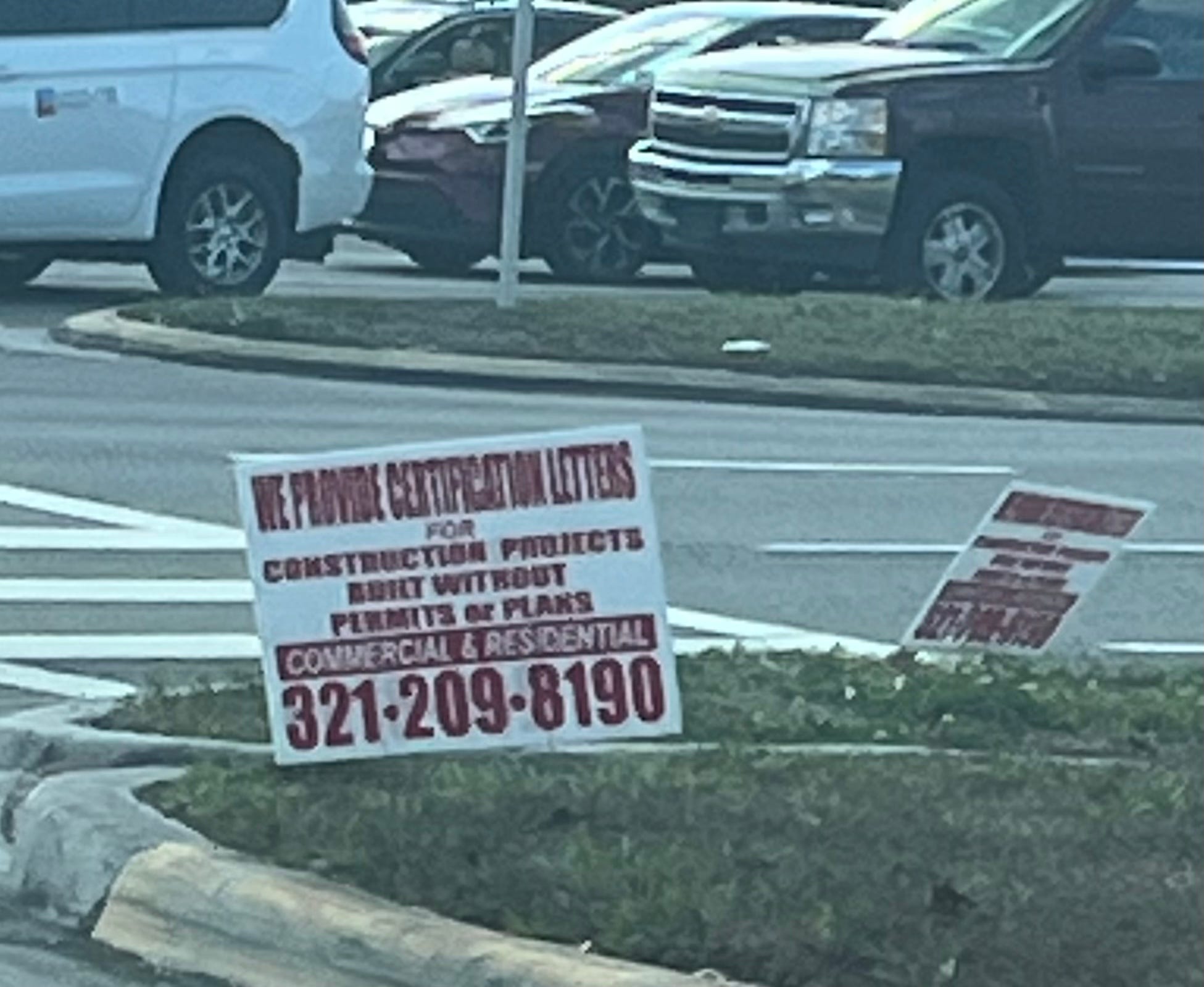
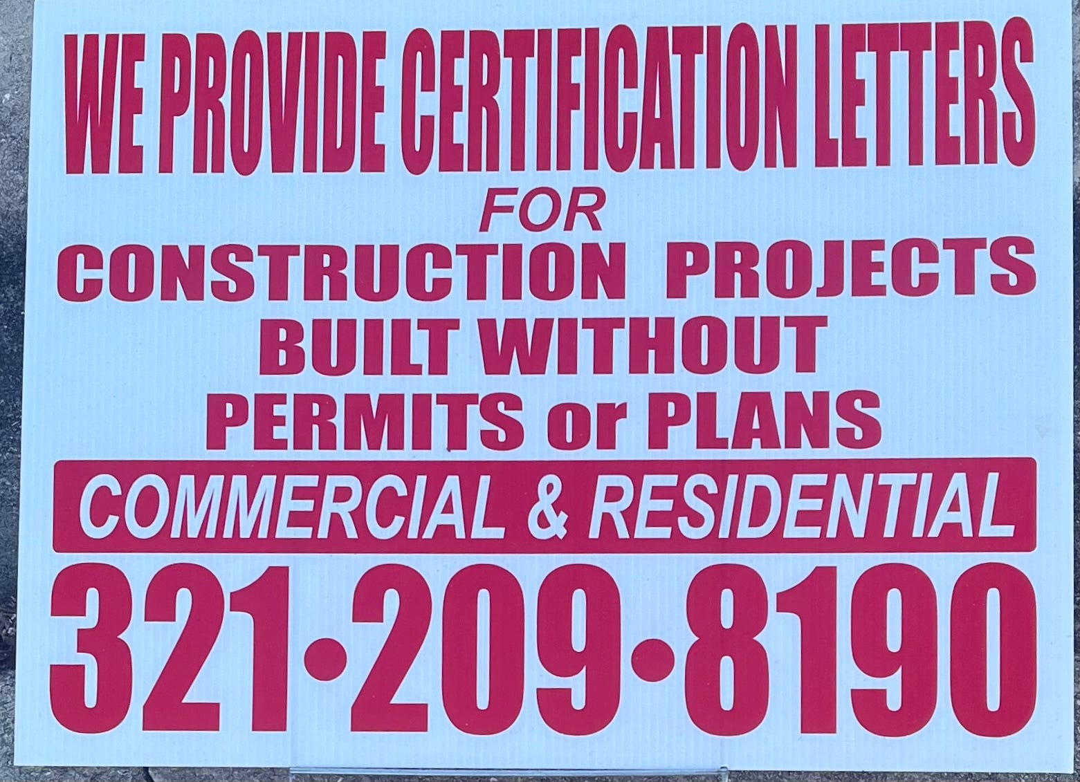
I encountered many of these yard signs around my neighborhood. They are an excellent example of all-caps abuse:
Update March 2026
I excerpted this from an article by a guy I worked for for a while. He continues to incorrectly believe that he has no license to alter government documents to make them more readable. Here is what he recently published in an article. He should have printed something more readable along with the unreadable original. After all, he would have if it had been in a foreign language. [This might as well have been in a foreign language. Very few readers are going to wade through this crap.]: